This is the last few seasons of Game of Thrones. D&D were so eager to finish their contract with HBO and get their Star Wars trilogy that they cut the legs out from underneath one of the best shows in television history… and then they never got their trilogy.
Rikertrombone.jpg
That implies they had the talent in the beginning, like the first panel of this comic. To better illustrate D&D and the GoT travesty, you’d have the first panels be equally artistic (because it’s another artist) and then the last like the last panel here, also partially burnt at the corners and water-stained, with less of a complete sentence in the bubble.
Eh, I liked a lot of changes they did. The last two books mostly consist of characters going on a quest, accomplishing nothing and more often than not being dragged back where they started. At least the show have them something to do.
Go for a walk, come back, continue drawing. 🤷
I don’t know why the talking dog didn’t think of that.
Little known fact that dogs have a very unhealthy work culture. He didn’t even think it would be an option to go out before the work was done.
But that wouldn’t be funny.
It’s funny, but I find it confusing that the style change happens on the same case the dog is announcing it. IMO, the style change should then occur on the next case.
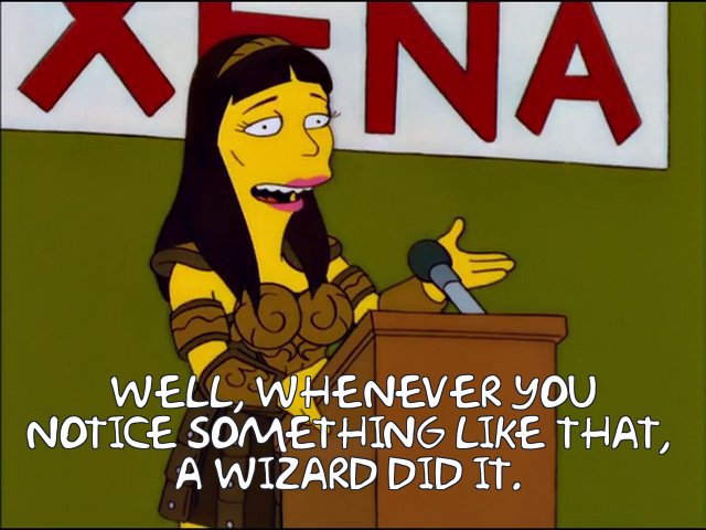
In episode 2F09, when Itchy plays Scratchy’s skeleton like a xylophone, he strikes the same rib in succession, yet he produces two clearly different tones. I mean, what are we to believe, that this is a magic xylophone, or something? Ha ha, boy, I really hope somebody got fired for that blunder.
We also would have accepted
Dog is powerful.
Correct. The moment dog wills something is the moment it comes to pass. Such is the way of the world.
I actually prefer it the way it’s executed.
Maybe I’m thinking way too much about this, but each panel obviously takes some time amount of time to draw, and likewise each panel portrays some finite amount of time–not just an instant snapshot of the story. So as the dog is yelling at him, his drawing quality is degrading as he is working on the panel, leading to an inconsistent quality within the panel.
he starts by drawing himself and the dog is drawn after its commentary/intervention
This is basically what happened with the Uzumaki anime
Saw episode one, thought it was dope. Saw drama about the immediate drop in quality before I caught episode 2 and now it’s been a bit hard to wanna jump back in.
That kickoff was so well done! Ya hate to see the immediate contrast…
Man I love this.
Is this an homage to a Pearls Before Swine strip?
Oi. Now, I gotta go find that one or I’ll go crazy.
The last panel reminds me of the “animator loses his mind and draws everything with his left hand” part of Don Hertzfeldt’s Rejected, albeit without the unnerving undertones.
Oohh! I had to look that up. Thanks for the wild trip!
If only you could do a joke and land on an incredibly detailed landscape drawing - then we’d have it all!
I feel this one.

