-
Welcome to 2013, Apple fans! Maybe in 5 more years you'll get
homescreen widgetscustomizable layouts (change number of apps per row etc). In 10 you might get custom launchers!-
Welcome to 2013, Apple fans! Maybe in 5 more years you'll get home screen widgets.
We actually do have home screen widgets, as of like 2020. They got it sometime before I had my iPhone. And an app drawer!
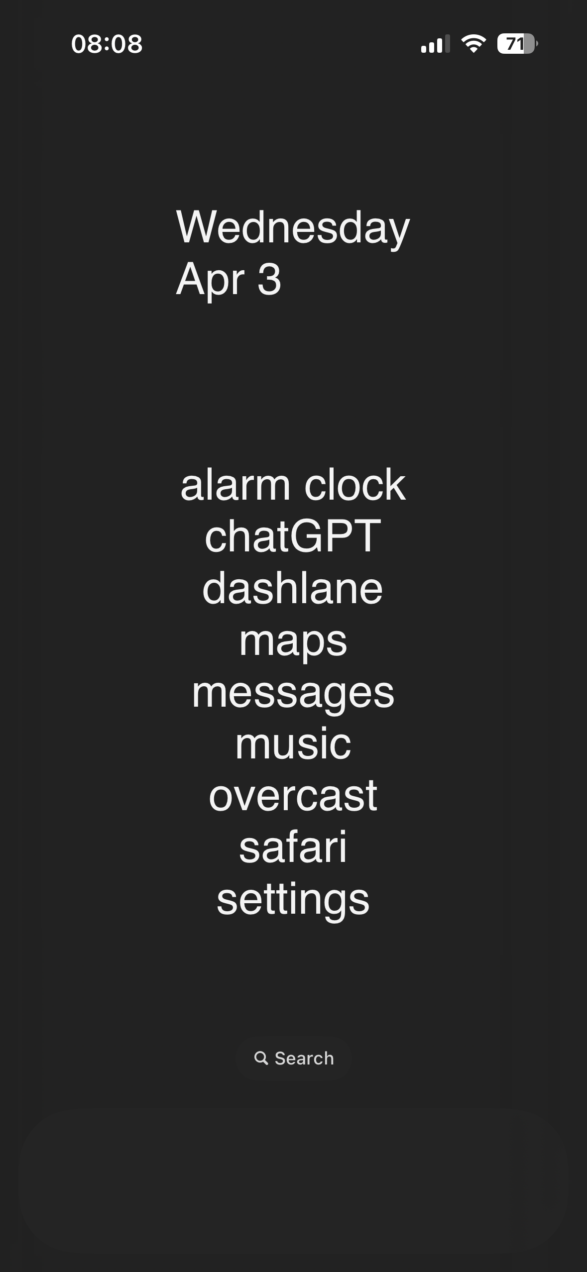
As a former Android user, my iPhone home screen looks wildly different from people who’ve had iPhones for many years. I have very few icons on my home screen, I have widgets taking up most of the top of the screen to push the icons I do have down near my fingers (because Springboard is still stupid as of iOS 17, as this gif is pointing out), I have more widgets to the left (“Today View,” Apple calls this, it’s basically just a scrolling widget section), and then the app drawer equivalent to the right (which Apple calls “App Library”). It’s clean and beautiful and reminiscent of my lovely Nova launcher setup I had on my beloved OnePlus 7T Pro (may it rest in peace).
Whereas most longtime iPhone users just have page after page after page of apps and folders. Every app they own is on there somewhere. Which is ridiculous since on iOS you can just swipe down, type the first few letters of the app, and there it is.
-
I remember having this feature on my jailbroken iPhone in like 2009. Wild that it took this long.
-
iOS already has widgets?
-
This interaction is so indicative of the reality of device fandom.
The Android user isn't storing information about the iPhone in their brain.
The iPhone user is responding like everybody knows everything about iPhone features and it was dumb of the android user to not know this thing.
-
-
2013? Pretty sure you could do this on Android waaaay before that.
-
My first Android was an HTC Hero, which was released in ~ October of 2009.
One of the first things I did was swap the location of the Maps and Store icons to make it easier to reach on the edge of the phone.
I recall people complaining that same year that the iPhone 1 couldn't copy or paste text.
:)
-
-
I'm not sure about iPhones, but iPads have had homescreen widgets for a whole year, maybe even two!
-
-
This is an April Fools, right?
No way a fancy top end smartphone in 2024 doesn't have this extremely basic feature from over a decade ago that everything has....
-
Ahh Apple, the first to introduce what Android users have simply taken for granted
-
iPhone just feels so unintuitive after using Android. Their UI absolutely sucks in my opinion.
-
I picked up an iPhone several years ago, I think a 6 or 6s? Anyways, I tried to use it for a while, because I work in IT and sometimes need to support people on their iPhone, and being an Android person, I had no idea what I was doing.
I could not stand it. Everything took so much more effort. I never got rid of my android, I just tried to use the iPhone whenever possible to familiarize myself with the apple way of doing things. I hated some of the layouts, I missed the back button... Even something as simple as copy/paste just seemed a lot more cumbersome for no good reason.
I learned a lot about it and where options and such were located (which is what I primarily needed) then I simply used it a bit less and less all the time until I finally stopped using it entirely. I have no idea where it is at this point, but I'm sure it still works and I'm sure I would still hate it. I've wanted to retry the experiment with a newer device like the X or 11 or something, but anytime I consider it, I just think back on my experience and unless I can pick up a relatively modern iPhone for next to nothing, I'm pretty uninterested in trying again. I know iOS has had a lot of updates in the past few years since I used one and maybe it sucks less? But I'm not willing to sacrifice my sanity to figure it out.
I don't mean to hate on iOS or iPhones. I certainly don't like them, but if that's what works for you, then go ham. I find it cumbersome and restrictive, and you're free to disagree and use whatever you like; don't let me stop you.
-
Right? I gotta use an iPad at work now and where the FUCK is the back button!?!? I'm so tired of mashing the home button. It's cool AF that my stylus will put text specifically where I write it though, and it translates my cursive!
-
You would think that. But as a person having an iPhone... No it is not. At least the part of iPhones currently not having that option. App-Icons on your "desktop" will always align in dense rows from top left to bottom right, with no free spaces allowed.
It is a bit weird, and I don't really see why, since you can change the order of icons in this dense row-grid. I am glad Apple warms up to the fact that people might actually want some kind of customization on their devices and not everything "the way Apple decrees it".
But to be really honest... I did not even notice prior to this post, and I had all Android before switching to my current iPhone. So at least for me this is a really small non-issue, and maybe a nice-to-have feature.
-
I was going to mention this. You can move them around; but you can't move them anywhere you want. The icons will always be, as you say, in a dense grid of rows with no "blank" spaces between the icons.
I don't know if the OP is true or satire or some kind of April fools thing, but it's still accurate.
-
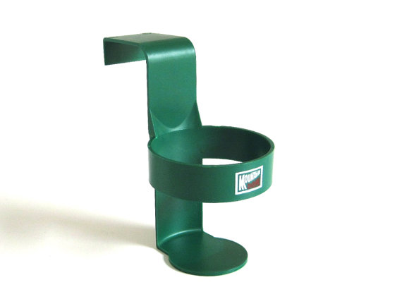
This remind me when in the 1980's Cup Holders were introduced in Dodge Caravans, but most cars they expected you to buy this and clip it onto the inside window the story https://historygarage.com/essential-evolution-handy-cup-holder/ e. 1980's
-
It's Apple, their entire business model is making their tech as restrictive as possible and stripping away as much freedom as they legally can. You can't name a company more power-hungry.
-
Its Apple. Control first, everything else third.
-
When everything = one of two.
It can
-
I had an iPhone before this Android I have now, and you could definitely put icons wherever you wanted on the home screen.
-
-
This is what my homescreen looks like and apple's struggling with placement of icons?

Edit: for those asking for theme, below is the video with instructions and apps used. https://youtu.be/UQKIUycDfQg Can't guarantee if it'll work for you.
-
unixporn material.
-
Holy fuck why is that so beautiful. You've unlocked something in me I didn't know was there and must pursue now.
-
What sort of gameboy is this?
-
You've taken "home screen as self expression" to a new level
level 70and I am here for it. -
Beautiful homescreen from a beautiful place
-
Sauce?
-
nice rice bro
-
I rarely comment but had to stop here to say, nice home screen.
-
lovely homescreen. thanks for sharing!
-
Yeah boiii! Look what I've got going on! These aren't just squares. They're cubes that rotate!! It's like the compiz dream in my hand!

-
-
I used to work with an Apple fanboy that knew next to nothing about how computers actually work, but he knew that Apple was the best at everything. Any time someone brought up something about a device or service from any other company or with any other OS, his stock answer was always "switch to Apple". Any time someone pointed out that their device offered a feature or functionality they appreciated that Apple did not offer in a convenient way, his stock answer was always "You don't need that." Sometimes he'd add "why would you want to do that? Do X instead".
Fast forward to today, I ended up killing him and am writing this from jail.
-
This is really my problem with Apple.
They make great hardware, and they make great software...but their answer to an XY problem is always W. You do things their way, or you don't do them.
And what they are really best at is marketing and simplicity. They market their simplicity. That attracts a lot of people who don't care to know any way of doing things other than the Apple way. Even if another way is objectively better in any or every way.
-
Good for you, man. Get yo life.
-
#relatable
-
Fast forward to today, I ended up killing him and am writing this from jail.
Okay, important question here: are you writing this on Android or iPhone?
-
Fast forward to today, I ended up killing him and am writing this from jail.
That went from 0 to 100 real fast.
-
Fast forward to today, I ended up killing him and am writing this from jail.
Leader! We shall rescue you!
-
-
RIP in peace Windows Phone 10. Still the best home screen setup ever.
-
Say what you will about Microsoft, lemmys, but Windows Phone 10 had great performance and battery life. It's a shame that it was nuked because MS couldn't bring themselves to go all the way on the Android bridge.
-
I'm a mobile developer and back around 2011 I was hoping like hell that Windows Phone would make it big. When you look at Xcode (for iOS), Eclipse (for Android and Blackberry) and MS Visual Studio (for Windows Mobile and Windows Phone) for mobile development, there was absolutely no comparison - it was Visual Studio all the fucking way. But Microsoft just decided to completely shit the bed and give up on mobile altogether. I still don't get it.
-
-
Honestly windows phone was sabotaged by both 3rd party developers who refused to port their apps to the platform, despite how easy it became AND did things like kill their own APIs to stop other developers from developing ports themselves, as well as by Google by not allowing their services on the platform.
The hardware was honestly top notch, even compared to my current S21 ultra. They were fairly pro consumer, having removable batteries, SD card slots and a 3.5mm jack right up until the end, even after the other big manufacturers removed them. And after the major update (the WP 8.1 update iirc) the software was really nice, intutive and pretty. I miss arranging and resising tiles, I miss having my pictures or album artworks showing up on the homescreen and I still use the Microsoft launcher on android to get the app drawer like I had on my WP.
-
Windows Phone was mostly sabotaged by first-party developers. Microsoft has a history of abandoning their mobile phone OSes after very short periods of time and nobody trusted them not to do it again. As a result few app developers bought into the ecosystem and smartphone enthusiasts told their friends not to get Windows phones, causing modest sales, causing Microsoft to immediately drop the platform.
As everyone expected them to.
-
What launcher are you using currently? I have Launcher 10 but I'm always looking for a new WP10 styled one to use
-
-
Yes, it was a shame, and it only died mainly due to the lack of available apps in the store and bad management. MS took too long to release it with Android and iOS already well established in the market.. It was also the OS that resisted the longest in the Pwn2Own Hacking Contest in these years. While Android and iOS went down in less than a minute, before the hackers could access the data, on WindowsPhone they hit their teeth on a rock, after half an hour they could only access the cookies.
-
Microsoft fucked up in the smartphone market so many different ways. The misunderstood the UX paradigms that would work, refused to change when Apple had obviously stolen their lunch money, stayed the bad course they were on when Android stole Apple's lunch money and then didn't even notice it has slammed Microsoft into some lockers because that's how little windows phone mattered. By the time Microsoft did like... Actual good market research and focus testing to build an actual good mobile os (maximally ironically based on their Zune UX which had failed previously because Microsoft was infinitely too slow to the mobile audio market) it was exactly as you said. The perfect mobile OS just 5 years too late to matter. More than anything what they needed to do was prove the apps you actually needed were present on their store and pay OEMs money to make windows phones to establish market share to make up for having a lower count of apps. They failed to do so. Now their actually genuinely brilliant mobile os only exists as a series of android apps that no one really gives a shit about.
-
-
You can still get it with android launchers. Was toying with them the other day. Launcher 10 I believe is pretty close.
-
I actually use Launcher 10. I love it minus the weird glitch where the letter selector from the all apps list occasionally not working. Best Android Launcher around
-
-
I was always shocked how smooth windows phone was. This system had potential but well.
-
can't get an windows 10 emulator for android?
-
I use Launcher 10. Close enough to a Windows Phone
-
-
-
Tbh the default launchers for mobile are garbage. Scrolling around looking for icons on a desktop like environment is not intuitive. Everyone's home screens just become a junk drawer of every app they've ever downloaded.
-
They can rip Niagara launcher from my cold dead hands I'm never going back to icon panels
-
Genuinely the only way I want to use my phone. Everything I use daily is on the home screen, everything else I have to go searching for. White background, black icons, all notifications turned off. Simple and easy!
-
If only the animations weren't broken for 3rd party launchers...
-
-
Niagra, Lynx, Olauncher(FOSS, previously Sentient launcher), are all very differebt cool usable launchers
-
Not everyone's default is garbage. LinageOS' launcher(Trebuchet) is good and I use it intsead of shit vendor launcher.
-
-
Believe it or not: Straight to jailbreak.
-
There is a tweak, which I don't recall even having on Android, that lets you select tons of apps and move them around, you know, like you could in a desktop environment... I wonder how much time will take to have that.
(Probably some 3rd party launchers or Android skins allow this, but I can't do it with Pixel Launcher).
-
Apple prison
-
-
This was not allowed before. Until just recently, the technology didn't exist to place icons anywhere in the grid. They would automatically smoosh up into orderly rows starting at the top-left with no gaps between icons. Apple is continuing to develop cutting edge innovation, though, and now you will be able to leave entire rows and columns empty, or any specific icon space you choose!
-
Apple fan boi here.
I also love to shit on Apple.
Some of the big reveals are so dumb. They just give things a different name to blow your mind.
“Omg! They invited spatial computing!!!”
-
It's not dumb because it works, doesn't it? Even haters spread the news.
-
-
Are they letting you guys keep your screens on yet? Or is that something that's being saved for 19? Probably not a big deal for most, but an always on display for time, calendar, and alerts without having to do anything to active my phone is clutch for me. When I see other peoples phones with blank black screens they look so dead.
-
They have actually introduced AOD, but only from the iPhone 15.
Their reasoning for not backporting the feature (unless phone is charging) is that the older models don't have LTPO displays that go down to the 1hz they do in AOD on the 15. A stupid reason imo.
-
It’s been around since 2022. Though I actually turned mine mostly off besides the clock because it’s just unnecessary and distracting the majority of the time. And super unhealthy.
-
Wouldn't this drain your battery and cause burn-in on your screen?
-
It does take more battery than just a blank screen, but it is kept extremely dim and automatically changes placement on the screen every so often so it doesn't burn in. Also, if it doesn't detect light (like if it were in your pocket) it turns off. I havent done the math, but i think playing a game on your phone for like 30 minutes would probably drain the battery a similar amount to a whole day if this display
-
-
Me on Linux changing the look of notification area with CSS stylesheet after installing an icon pack that works not only on app launcher but in most of the system.

PS Don't forget to install this Magisk module that hacks Google checks so you can still log-in to your bank after you changed animations style via that other Magisk module.
-
...I thought we all just stopped having apps the Home Screen when we could put them in the library and unclutter everything.
-
Yeah I have almost no apps on my Home Screen. Just one page of widgets, and 3 pinned to the bottom.
Otherwise if I want an app I just use spotlight. Quick swipe down and the first letter or 2 of any app and I’m in. I almost never touch the App Library.
This prob comes from using spotlight so much on Mac as well though.
-
I hadn’t considered the connection, but now that you mention it I use Spotlight pretty much exclusively on my Mac too. Hopefully they don’t mess that feature up in the future or I’m going to have to learn how to manually organize things.
-
-
lol yeah I literally use Spotlight for everything, it’s way faster the majority of the time.
-
You've just moved the same problem somewhere else if you do that.
I run a "main" home screen with Clock, Calendar, Weather and Alerts, then the next one is apps I commonly use, separated into folders, tools, photography, entertainment, comms, MFA, and then the next screen is my email.
-
Eh, the default organization they put on the App Library doesn't offend me. I did add a widget for Reminders and another for Music though.
-
-
To be fair, as both an iOS and Android user, the way android moves icons around drives me crazy , I much prefer the iOS “shift everything down” approach
-
I don’t get it, I’m on iOS 17 and can move them around? I came from a pixel and I was surprised that you could. And you can also stack widgets which is nice
-
This meme would be 1000% better with sound lol
-
Here is an alternative Piped link(s):
https://piped.video/LgncSiSnIyI?si=vsSfn4_DBOkOMTgG
Piped is a privacy-respecting open-source alternative frontend to YouTube.
I'm open-source; check me out at GitHub.
-
-
Where is the clip at the bottom from?
-
-
Here is an alternative Piped link(s):
https://piped.video/LgncSiSnIyI?si=vsSfn4_DBOkOMTgG
Piped is a privacy-respecting open-source alternative frontend to YouTube.
I'm open-source; check me out at GitHub.
-
Thank you!
-
-
-
Reminds me of this https://youtu.be/9BnLbv6QYcA?si=gRyq1w2l4X6HYgC-
-
Here is an alternative Piped link(s):
https://piped.video/9BnLbv6QYcA?si=gRyq1w2l4X6HYgC-
Piped is a privacy-respecting open-source alternative frontend to YouTube.
I'm open-source; check me out at GitHub.
-
-
Dude you cannot just post something that good and not share. I love nier.
-
I think you meant to reply to this comment.
-
-
COURAGE!!
-
COURAGE!!
-
Now do jxl support
-
Control freak Apple throwing their customers another small scrap.
-
I should really switch to Android
-
I hope it's an option you can toggle. I like the existing system which is essentially a list view where it reflows when you remove an icon. My desktop icons are set to work like this too.
I wonder how they've implemented this for iPads since there the way the layout behaves (list vs 2D grid) actually makes a difference when you rotate the screen.
-
I they didn't need Steve jobs to think for them they wouldn't have bought Apple.
-
haha apple bad amirite
-
Counterpoint: green bubbles.
-
I thought this shit was a meme till I started texting someone yesterday to arrange a date, she said "you don't have iPhone?"...
-
Sounds like she saved you a lot of trouble, lol
-
yikes, majority of the world uses android
-
Counter counterpoint: no one cares what color the bubbles are, except the person reading em. Sounds like an iOS problem 😉
-
But the green ones aren't ripe yet.
-
-
Looking at iOS innovations going in android direction, they gonna make iphone with green bubbles someday and present it as amazing innovation, bet they even make you pay for subscription to make your bubbles green
-
I personally don’t need that feature to be honest…
-
Fuckin' bollocks.
-
Yeah I don’t want my bollocks to be placed anywhere
-
-
the point is that people should have the option even if you personally don't need it
-
Android: "Check out all these options. You can customise it just as you'd like"
Apple: "Check it out! This is the best user interface ever. No need for customisation"
-
-
You personally don't need a phone either.
-